Rewild Colors Make Wellness Homes Feel Alive
There is a quiet shift happening inside modern homes, and it does not look like another round of all-white walls, chrome finishes, or showroom minimalism. It looks softer, moodier, earthier, and a little more alive, almost as if the house has started breathing with the landscape outside the window. That is why rewild colors are becoming such a strong keyword in the conversation around interiors, wellness, and everyday comfort. Instead of treating color as decoration, this movement treats it as a wellness tool, a way to make rooms feel grounded, restorative, and emotionally honest. For a generation that has lived through remote work, digital overload, climate anxiety, and nonstop lifestyle optimization, the home is no longer just a backdrop; it is becoming a nervous system reset.
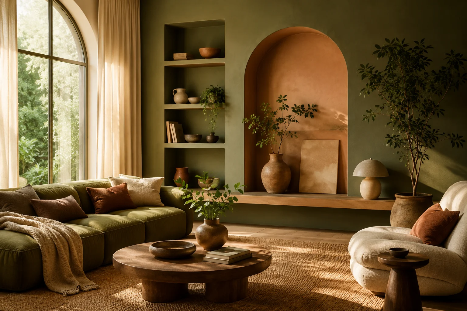
The phrase may sound trendy, but the feeling behind it is familiar. People are craving spaces that feel less processed and more connected to nature, not in a fake “add one plant and call it organic” way, but in a deeper sensory way. Think mossy greens, clay browns, mineral blues, soft mushroom neutrals, muted charcoal, smoky plum, faded terracotta, bark-inspired taupe, and warm off-whites that feel touched by sunlight rather than bleached by it. These tones do not shout for attention, yet they change the emotional temperature of a room almost instantly. They remind us that home wellness is not only about air purifiers, cold plunges, or expensive candles; sometimes, it begins with what the eye sees every morning.
Why Rewild Colors Are Taking Over Modern Homes
The rise of rewild colors makes sense because design culture has been moving away from sterile perfection for a while. The crisp white interiors that once dominated social feeds looked beautiful in photos, but many of them felt hard to live in, especially when real life entered the frame. A home with children, pets, work bags, coffee cups, laundry piles, books, plants, and half-finished routines needs a little more forgiveness. Earth-based colors offer that forgiveness because they already contain visual depth, variation, and softness. They make a room feel styled without demanding that every object stay perfectly in place.
This is also a reaction against the endless brightness of digital life. Most people now spend hours looking at screens that glow in sharp blues, whites, and high-contrast interfaces. When they step away from that world, they want walls that help their eyes relax instead of continuing the same visual pressure. A muddy green dining room, a warm brown bedroom, or a soft charcoal reading corner can feel like a gentle exhale after a day of notifications. In that sense, rewild color is not about nostalgia or rustic fantasy; it is about designing a healthier transition between online intensity and offline recovery.
Another reason the trend is landing now is that wellness itself has become more grounded. The old wellness aesthetic often leaned toward spotless spas, pale woods, white towels, and perfectly arranged stones. That look still has its place, but many people now want wellness spaces that feel more human, textured, and personal. A room can be calming without looking empty, and it can be restorative without looking expensive. Rewild palettes support that shift because they bring in the complexity of real nature, where calm is not blank but layered.
Rewild Colors and the New Home Wellness Mood
The strongest thing about rewild colors is that they blur the line between design and feeling. A sage green wall does more than add color; it can make a kitchen feel slower and more grounded. A clay-toned hallway can make the transition from the outside world into the home feel warmer and less abrupt. A deep brown bedroom can create a cocoon effect that makes sleep feel more protected. These choices work because they engage the body before the mind has time to analyze them.
Color psychology is often oversimplified, but most people understand the basic experience intuitively. Some rooms make us tense, while others make us want to sit down, breathe deeper, and stay longer. Rewild palettes are effective because they borrow from environments humans already associate with refuge, shade, soil, stone, forest, water, dusk, and morning light. They do not need to look exactly like a forest cabin or a desert retreat to carry those cues. Even in an apartment, a soft olive wall or a mushroom-toned bedroom can bring a subtle sense of outside calm into everyday life.
This is where home wellness design becomes more interesting than a checklist of products. The question is no longer only what you buy for your home, but how your home makes you feel throughout the day. Does your living room support rest, or does it keep your brain switched on? Does your bedroom feel like a place to recover, or does it feel like a storage zone with a bed in it? Does your kitchen encourage slow rituals, or does it feel like a bright task station that never fully powers down?
The Return of Emotional Color
For years, many interiors avoided emotional color because resale value, algorithm-friendly styling, and neutral staging pushed people toward safer choices. Beige, white, and gray became the default language of “good taste,” especially in homes designed to photograph well. But homes are not only assets, and they are not only content backdrops. They are where people recover from work, handle stress, cook for themselves, call family, deal with difficult days, and build private rituals that nobody else sees. Emotional color matters because it gives those ordinary moments more atmosphere and meaning.
Rewild palettes bring emotion back without making a home feel chaotic. They are not about neon walls, random accent colors, or dramatic statements in every room. Instead, they use nature-based depth to create moods that can still feel sophisticated and timeless. A muted plum powder room can feel intimate without becoming theatrical, while a dark green office can feel focused without becoming heavy. The magic is in choosing colors that have enough complexity to feel alive but enough softness to remain livable.
From Minimal White Rooms to Living Palettes
The move toward natural interior colors is also part of a larger fatigue with flat minimalism. Minimalism once promised clarity, but in many homes it became a pressure system of constant editing, hiding, and visual control. A white room can look calm when it is empty, but it can also show every stain, every shadow, and every object that does not belong. Rewild color gives people permission to live with texture, age, patina, and imperfection. It makes the home feel less like a set and more like a place that can hold a real life.
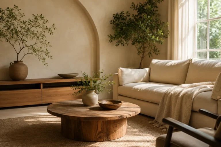
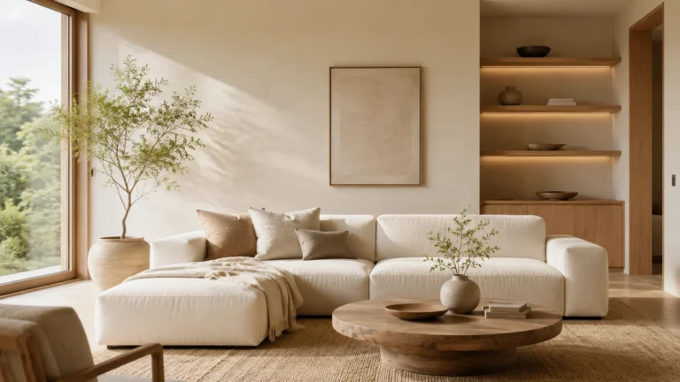
This shift does not mean minimalism is dead. It means minimalism is getting warmer, deeper, and less obsessed with blankness. A calm home can still have clean lines, open space, and thoughtful storage, but the palette does not have to disappear. Instead of white walls with beige furniture, a slow living space might use warm taupe walls, natural linen, walnut wood, stoneware, a darker sofa, and leafy plants with sculptural shapes. The result still feels simple, but it has soul.
There is also a practical advantage here. Rewild colors tend to layer beautifully with materials people already love, including wood, rattan, wool, linen, ceramic, leather, stone, brass, and handmade objects. They can make budget furniture feel more considered because the room itself carries depth. They also create a stronger backdrop for personal items, from art prints and travel finds to inherited pieces and thrifted objects. Instead of forcing everything to match, these palettes make variation feel intentional.
Why Nature-Based Neutrals Feel Fresh Again
Neutrals are not going away, but the definition of neutral is changing fast. The new neutral is not just white, gray, or beige; it can be moss, clay, bark, charcoal, flax, sand, fog, mushroom, olive, or river-stone blue. These colors act like neutrals because they are easy to live with, but they carry more emotional range than flat builder shades. They help rooms feel calm without draining them of personality. That balance is exactly why rewild palettes are becoming so useful for people who want change but do not want visual chaos.
A nature-based neutral also changes with light in a more interesting way. In the morning, a soft green wall can feel fresh and bright, while at night it can become quiet and enveloping. A warm taupe can look sandy in daylight and almost cocoa-toned under lamps. This movement across the day makes the room feel more connected to time, weather, and routine. It is a small detail, but it helps a home feel less static and more alive.
How Rewild Colors Support Slow Living
Slow living is often misunderstood as a perfect lifestyle full of linen aprons, homemade bread, and endless free time. In reality, it is more about creating small pauses inside ordinary life. It is the chair near the window where you drink coffee without opening your laptop. It is the bedroom that actually invites sleep instead of becoming a second office. It is the entryway that helps you put down the day before carrying stress into the living room. Rewild colors support that rhythm because they gently slow the visual pace of a home.
Fast interiors tend to feel high contrast, glossy, and overstimulating. They can be exciting for a moment, but they often make rest harder. Slow interiors are different because they use softer contrasts, tactile materials, and colors that feel settled rather than urgent. A muted earth palette naturally fits this approach because it does not demand constant attention. It creates a background that lets daily rituals become the focus.
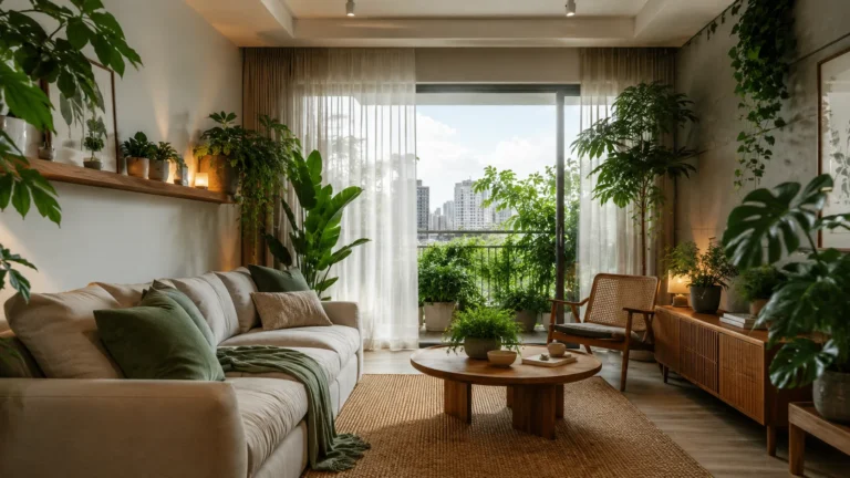
For Havens Compass readers, this is where the trend becomes more than a paint story. It connects directly to better everyday spaces, from a calmer breakfast corner to a more restorative shower routine. A rewild palette can make even small apartments feel more intentional because color can define zones without building walls. A dusty green reading nook, a clay-toned dining wall, or a deep blue bedroom corner can create emotional boundaries inside one compact floor plan. That matters because many modern homes now need to support work, rest, movement, entertainment, and recovery all at once.
Color as a Daily Ritual Cue
One overlooked part of color is how it can signal behavior. A soft, dark bedroom tells the body that the day is ending. A warm kitchen corner can make breakfast feel more intentional instead of rushed. A green bathroom can turn an ordinary shower into something closer to a reset. These are not dramatic transformations, but they add up because home is experienced through repetition.
When a color cue is consistent, it starts becoming part of a ritual. The same earthy tone that greets you in the entryway can make coming home feel like a boundary between public energy and private calm. The same muted wall behind your desk can make work feel focused without becoming harsh. The same soft neutral in your bedroom can help create a more reliable wind-down routine. This is why wellness interiors are moving beyond objects and into environmental design.
The Best Rooms for Rewild Color Palettes
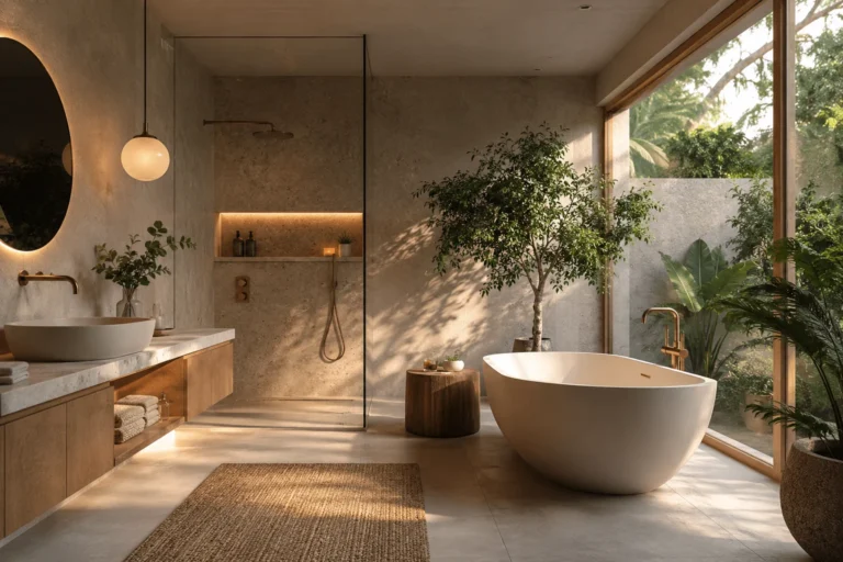
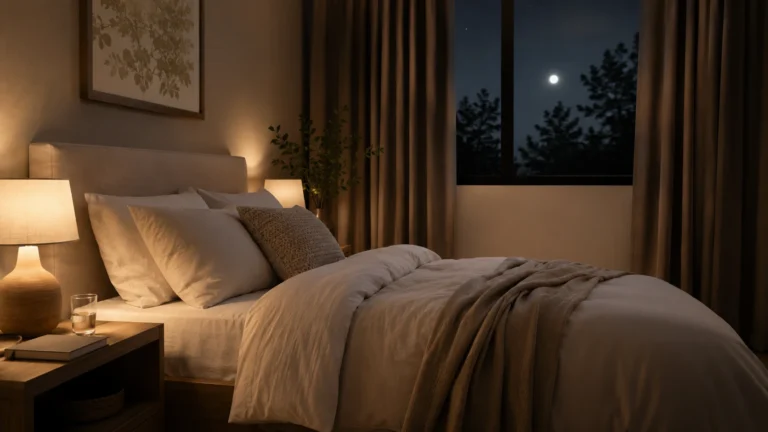
The beauty of rewild color palettes is that they can work almost anywhere, but they behave differently depending on the room. In bedrooms, deeper earthy tones can create a sheltered, sleep-friendly mood, especially when paired with soft lamps and natural bedding. In living rooms, moss, taupe, and warm charcoal can make shared spaces feel intimate without shrinking them too much. In kitchens, clay, olive, and creamy mineral tones can soften the functional edges of appliances, counters, and cabinets. In bathrooms, muted greens and stone colors can bring a spa feeling without relying on cold white tile.
Entryways are another strong place to experiment because they set the emotional tone of the whole home. A richer color in a hallway or foyer can make arrival feel intentional, even when the rest of the house stays neutral. Small spaces also handle bolder rewild shades surprisingly well because the commitment is contained. A powder room in deep forest green or smoky brown can feel luxurious rather than overwhelming. The key is to treat color as atmosphere, not just surface.
Home offices may benefit the most from this movement because many people still struggle with rooms that feel too much like temporary workstations. A rewild color can make a desk zone feel less corporate and more connected to the rest of the home. Darker greens, blue-grays, muted browns, and mineral neutrals can support concentration while avoiding the sterile mood of blank white walls. They also look good behind video calls without turning the room into a staged backdrop. That blend of function and feeling is exactly what modern home design needs.
How to Use These Colors Without Overdoing It
The easiest mistake with any trend is trying to apply it everywhere at once. Rewild design works best when it feels discovered, not forced. Start with one room, one wall, or one zone that already needs more emotional clarity. Then build around that choice using materials and textures that feel connected, such as linen curtains, wood furniture, woven storage, stone trays, ceramic lamps, and plants with real presence. The goal is not to create a theme room; it is to create a room that feels rooted.
Lighting is just as important as the paint itself. A beautiful earthy color can look flat under harsh overhead lighting, while the same color can feel rich and calming under layered lamps. Warm bulbs, shaded fixtures, and indirect light help rewild colors reveal their depth. Natural light also changes these colors throughout the day, so testing samples on multiple walls is worth the patience. A shade that looks perfect at noon may feel too heavy at night, and a color that looks quiet in the morning may become the room’s best feature after sunset.
Materials Matter as Much as the Paint
A rewild room is not built by color alone. The palette works best when it is supported by materials that feel tactile, imperfect, and connected to the natural world. Matte finishes usually work better than glossy ones because they absorb light in a softer way. Wood grain, woven fibers, unpolished stone, handmade ceramics, and nubby fabrics all help the palette feel grounded. Without those textures, earthy colors can look staged rather than lived in.
This is where the wellness impact becomes more sensory. A room painted in muted green feels different when it also includes a wool rug, linen bedding, a wooden bench, and a ceramic lamp with a warm glow. The colors speak to the eye, while the materials speak to the hand and body. Together, they create a more complete experience of comfort. That is why the strongest homes in this trend do not look decorated as much as composed.
There is also a sustainability-adjacent mindset behind the look, even when homeowners are not making a strict eco-design statement. Rewild interiors often pair well with vintage furniture, reused pieces, natural materials, and slower purchasing habits. Instead of chasing a room that looks brand-new from one store, people can build spaces over time with objects that have texture and memory. This makes the home feel less disposable and more personal. In a culture full of quick makeovers, that slower approach feels quietly radical.
The Wellness Impact of Warmer, Wilder Homes
The wellness conversation around interiors is becoming broader and more realistic. People are realizing that a healthy home is not only about products with wellness labels. It is also about how rooms support attention, rest, social connection, privacy, and daily recovery. Rewild colors help because they bring emotional warmth into spaces that may have become too optimized, too bright, or too visually thin. They make wellness feel less like a luxury routine and more like a background condition of daily life.
This matters because many people are spending more time at home while also expecting more from home. The living room has to be a social space, decompression zone, media room, and sometimes work overflow area. The bedroom has to compete with phones, stress, and irregular schedules. The kitchen has to handle nutrition, speed, family, and routine without becoming another performance space. A thoughtful color palette will not solve every problem, but it can reduce friction and make the home feel more supportive.
There is a reason spa hotels, retreat houses, and boutique wellness spaces rarely rely on harsh sterile color anymore. They increasingly use warm neutrals, shadowy greens, mineral grays, and earth tones because those palettes make guests feel held. Residential design is borrowing that lesson and making it more personal. The best version does not copy a hotel; it translates that sense of calm into a home that still feels lived in. That is the real promise of this trend.
A Softer Alternative to Over-Designed Wellness
Wellness at home can easily become another form of pressure. There is always another gadget, supplement, routine, or upgrade being marketed as the missing piece. Rewild interiors offer a softer alternative because they begin with atmosphere rather than achievement. You do not have to buy a full wellness room to feel the difference between a harsh space and a calming one. Sometimes, changing the color story of a room can shift how you move through it.
That does not mean color is magic. A badly organized room painted in a beautiful shade can still feel stressful. But color can support better habits when paired with thoughtful layout, less clutter, warmer lighting, and spaces designed around actual routines. A calming palette makes it easier to notice what belongs and what does not. It also makes simple rituals, like reading, stretching, cooking, journaling, or winding down, feel more natural.
Why This Trend Feels Gen Z and Timeless at Once
One reason this trend feels current is that it speaks to Gen Z’s relationship with design. Younger homeowners and renters often want spaces that feel expressive, emotionally aware, and less bound by old resale rules. They are comfortable mixing vintage with modern, high with low, handmade with digital, and soft minimalism with bold personal choices. At the same time, they are skeptical of interiors that look too perfect or too empty. Rewild colors fit that mood because they feel designed but not fake.
Still, the trend is not only youthful. Earth-based palettes have always existed in beautiful homes, from historic interiors and Mediterranean houses to Japanese-inspired spaces, desert retreats, and countryside cottages. What is new is the way these colors are being framed through wellness, slow living, and emotional sustainability. Instead of being treated as old-fashioned or rustic, they are being reintroduced as modern tools for better living. That gives the trend a wide reach across styles and generations.
The most timeless version will avoid copying a palette too literally from a trend report. A home should not look like a color forecast; it should look like the people who live there. That means choosing rewild shades that match the climate, architecture, light, furniture, and emotional needs of the household. A coastal apartment may lean into foggy blue and sand, while a city loft may feel better with olive, charcoal, and warm wood. The trend becomes lasting when it is interpreted personally.
How to Build a Rewild Palette at Home
Building a rewild palette starts with noticing what kind of nature actually calms you. Some people feel restored by forests, so they may gravitate toward moss, fern, bark, and shadow. Others feel relaxed by desert landscapes, which can lead to clay, sand, ochre, cream, and sun-baked brown. Some people feel most peaceful near water, making mineral blue, mist gray, driftwood, and deep green a better fit. The goal is not to pick the trendiest color, but to identify the landscape your nervous system wants to come home to.
Once that mood is clear, the palette should be built in layers. A main wall color can set the base, while furniture, textiles, art, and smaller objects add variation. Contrast should come from texture as much as color, because too many competing shades can make the room feel busy. A clay wall with cream bedding, dark wood, woven baskets, and muted green art may feel more complete than a room with five different accent colors. Rewild design is less about collecting colors and more about composing a habitat.
- Choose one grounding shade, such as moss, clay, taupe, charcoal, or mineral blue.
- Add two supporting tones that feel related, not random, so the room stays calm.
- Use natural textures to create depth before adding more color.
- Test paint in morning, afternoon, and evening light before committing.
Renters can still use this approach without repainting an entire home. Textiles, removable wallpaper, curtains, rugs, lampshades, bedding, artwork, and even painted furniture can shift a room’s mood. A rewild bedroom can begin with olive bedding, warm wood side tables, a linen curtain, and a ceramic lamp. A living room can change through a deeper rug, earthy cushions, natural baskets, and art that pulls from landscape tones. Even small changes can make a space feel more connected and less digitally cold.
The Future of Better Everyday Spaces
The bigger story behind rewild colors is that people want everyday spaces to do more emotional work. They want homes that help them transition, recover, focus, gather, and rest without constantly needing to escape somewhere else. This is especially important as wellness becomes less about occasional retreats and more about the ordinary environments people return to every day. A home that feels good on a random Tuesday night may matter more than a home that looks perfect in one photo. Rewild design understands that difference.
Future homes will likely continue moving toward flexible layouts, warmer materials, softer lighting, and more layered color. The open-concept era is already being questioned because people want spaces that can shift between connection and privacy. Color will play a major role in that shift because it can define zones without expensive renovations. A deeper dining area can feel separate from a lighter living space, while a calm bedroom palette can signal rest even in a busy household. This makes color one of the most accessible tools for better everyday living.
At the same time, the best homes will not become dark, muddy, or overly serious. Rewild does not mean gloomy. It can include joyful greens, warm sunlight neutrals, soft terracotta, faded blues, and colors that feel fresh rather than heavy. The point is to bring back the complexity of nature, where brightness and shadow exist together. A good rewild palette should feel like a walk outside after too much time indoors.
Conclusion: Rewild Colors Are More Than a Trend
The rise of rewild colors shows that home design is entering a more emotional, sensory, and human chapter. People are no longer satisfied with spaces that simply look clean, expensive, or algorithm-ready. They want rooms that support better mornings, calmer nights, deeper rest, and more meaningful daily rituals. Earthy greens, warm browns, mineral blues, soft charcoals, and clay-toned neutrals are becoming popular because they answer that need without shouting. They make the home feel less like a container and more like a living refuge.
This trend also reminds us that wellness does not always begin with a major renovation. It can begin with the color of a wall, the warmth of a lamp, the texture of a blanket, or the way a room feels when the day slows down. A rewild palette gives people permission to move away from sterile perfection and toward spaces that feel layered, forgiving, and alive. That is why the movement has staying power beyond one season of design headlines. In a world that often feels too fast, too bright, and too artificial, a home shaped by rewild colors feels like a quiet return to something real.