Yinka Ilori Dunelm Collection Brings Bold Joy
A lamp that looks like it wandered in from a joyful 1970s lounge, bedding covered in exuberant flowers, and chairs designed to turn conversations into part of the furniture are not the usual ingredients of a quiet summer retail launch. Yet the Yinka Ilori Dunelm collection arrives with no interest in being quiet, cautious, or easily ignored. The limited-edition range brings the British-Nigerian artist and designer’s unmistakable language of saturated color, rhythmic geometry, and cultural storytelling into everyday homes at accessible high-street prices. It is a collaboration built around more than visual impact, because beneath the turquoise lamps, green upholstery, and layered patterns sits a bigger idea about how domestic spaces shape emotion. At a moment when many interiors are moving away from anonymous gray rooms, Ilori and Dunelm are offering a confident argument that a home can be practical, personal, and seriously joyful at the same time.
The timing makes the collection feel especially noticeable. Summer is often when homeware retailers pause major launches, clear seasonal stock, and wait for autumn trends to begin their annual takeover. Dunelm has instead used the middle of the season to introduce a colorful 40-piece collaboration across furniture, lighting, bedding, towels, cushions, and rugs. Prices reportedly begin with an affordable cotton jacquard hand towel, allowing shoppers to enter Ilori’s world without redesigning an entire room or making a major financial commitment. That accessibility matters because bold design is frequently presented as something reserved for galleries, boutique hotels, or homes with generous decorating budgets. By placing Ilori’s visual storytelling inside a mainstream retailer, the collection turns expressive interior design into something people can explore one cushion, towel, or bedside lamp at a time.
A High-Street Collection That Refuses to Blend In
Walk through many mainstream homeware sections and the safest colors usually dominate the first impression. Beige, cream, stone, charcoal, and muted green have become reliable choices because they photograph well, coordinate easily, and rarely scare off a cautious buyer. The problem is not that neutral interiors are automatically dull, but that constant repetition can make completely different homes feel like they were assembled from the same digital mood board. The Yinka Ilori Dunelm collection pushes in the opposite direction by treating pattern and color as fundamental parts of a room rather than decorative details added at the end. Its pieces are intended to be seen, remembered, discussed, and lived with, which gives the range an identity that feels unusually clear for a large retail collaboration.
Ilori’s work has long challenged the idea that serious design must appear restrained. His projects often use bold color as an emotional and social tool, whether he is working on public installations, playgrounds, architecture, furniture, textiles, or domestic objects. Rather than treating brightness as a surface-level trend, he connects it to memory, optimism, resilience, and the energy of shared spaces. That approach becomes particularly interesting inside a home, where every object eventually joins the routines of real people rather than remaining perfectly styled for a campaign image. A bright chair may become the place where someone drinks coffee every morning, while a patterned duvet can quietly change the mood of a bedroom before the day has even started.
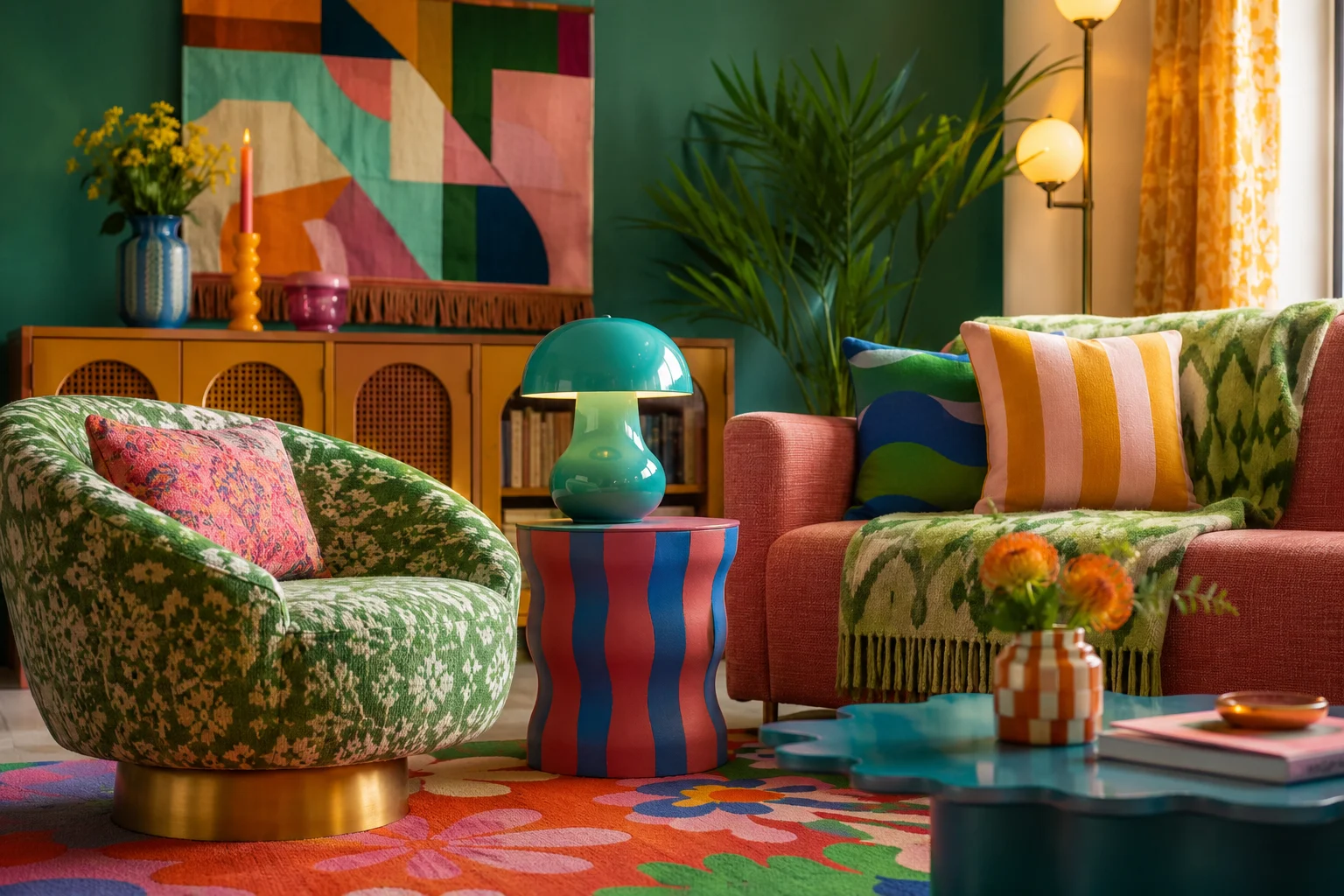
The range reportedly includes several pieces that immediately communicate this philosophy. A turquoise Bell LED lamp brings a curved, retro silhouette into the collection, while floral bedding combines familiar domestic references with more energetic motifs. The Sweet Flows swivel chair uses green jacquard upholstery and a rounded form that feels both nostalgic and contemporary. There are also patterned cushions, rugs, side tables, dining chairs, storage furniture, and decorative lighting designed to work as either individual statements or a more complete visual environment. What connects them is not perfect uniformity but a shared sense of movement, as if every line, petal, stripe, and curve belongs to an ongoing conversation.
The Story Behind the Yinka Ilori Dunelm Collection
The collaboration becomes more meaningful when viewed through the histories of both Ilori and Dunelm. Ilori grew up in north London within a British-Nigerian family, surrounded by cultural references, community gatherings, vivid clothing, family stories, and the kind of everyday visual language that rarely fits inside a single design category. Dunelm, meanwhile, began as a market-stall business selling curtains and soft furnishings before developing into one of Britain’s largest homeware retailers. Although their scales and creative backgrounds are different, both stories are grounded in ordinary communities rather than distant luxury culture. That shared foundation gives the collection a warmer character than a standard celebrity-style product endorsement.
Community is not simply a marketing theme placed around the finished objects. It appears to have shaped the visual references chosen for the range, including a nod to the people and cultures connected to Leicester’s textile history. Leicester’s manufacturing identity was built through the work of communities with roots across Asia, Africa, and the Caribbean, creating a city whose textile story cannot be separated from migration and cultural exchange. Floral motifs in the collection reportedly include lotus and jasmine, plants associated with India and Pakistan respectively. Their inclusion transforms a floral pattern from generic decoration into a subtle acknowledgment of the communities behind the places, industries, and retail histories surrounding the collaboration.
This type of reference works best when it remains part of a broader design story instead of becoming a visual footnote. Ilori’s patterns often feel playful on first encounter, yet they reward a slower look because color, shape, and symbolism are layered together. A flower can operate as a cheerful motif while also carrying cultural memory, and a chair can function as seating while reflecting ideas about family interaction. The collection therefore encourages shoppers to see homeware as more than an assembly of practical items selected to fill empty space. Objects can still be affordable and functional while holding stories about where people come from, who made a city, and how different traditions meet inside a contemporary British home.
Furniture Designed Around Human Connection
One of the most revealing pieces is the swivel chair, not only because of its saturated upholstery or retro shape but because of the behavior it invites. A swivel seat lets a person turn toward someone entering the room, shift between different areas, or rejoin a conversation without dragging furniture across the floor. That small movement might sound insignificant, yet it reflects a way of designing around social interaction rather than treating furniture as a fixed display. Ilori has repeatedly explored gathering, communication, and shared joy in his wider practice, so the chair becomes a domestic version of those larger ideas. It is furniture that looks expressive while quietly supporting the basic human act of turning toward another person.
This detail also reveals why the range fits current conversations around better everyday spaces. A well-designed home is not simply the one with the most expensive materials or the cleanest photographs. It is a place where movement feels natural, routines have support, and the layout makes connection easier rather than forcing everyone into isolated corners. Furniture that responds to conversation can contribute to that feeling, just as warm lighting can make an evening softer or tactile fabric can make a reading spot more inviting. The result is not wellness in the clinical sense, but a more human version of comfort built into the objects people already use.
Why Color Is Returning to Everyday Interiors
The launch lands during a broader shift in how people are thinking about color at home. After years of cool gray rooms, highly controlled minimalism, and interiors designed around resale-friendly neutrality, many households are becoming more comfortable with spaces that reveal an actual personality. This does not mean every wall is suddenly turning orange or that every room needs three competing patterns. Instead, people appear increasingly willing to add one vivid lamp, a striped chair, patterned bedding, or artwork that carries emotional weight. The move is less about rejecting calm and more about recognizing that visual warmth can be calming in its own way.
The phrase “dopamine decor” has often been used to describe this return to bright, uplifting interiors, although the best examples go beyond chasing a temporary burst of visual excitement. Color can guide attention, define zones, revive familiar furniture, and create a rhythm between rooms. It can also make a home feel more personal because color choices reveal preference in a way that safe neutrals sometimes avoid. Ilori’s work offers a mature version of joyful design by connecting brightness to storytelling and cultural experience. His palette is energetic, but it rarely feels random because the shapes and colors are organized around a clear emotional purpose.
For Dunelm, the collaboration extends an existing interest in more adventurous interiors rather than appearing as a sudden change of direction. The retailer has previously introduced colorful collections that encouraged customers to move beyond plain foundations and experiment with pattern. What Ilori adds is a particularly strong visual identity that can make even a small object feel like part of a larger design universe. This gives shoppers permission to be bolder without requiring them to invent a full scheme from scratch. A curated collaboration can reduce the fear of mixing colors because the pieces have already been designed to share a visual relationship.
Colorful Does Not Have to Mean Chaotic
Many people avoid expressive homeware because they worry a room will become visually exhausting. That concern is understandable, especially when social media often presents maximalism as an all-or-nothing commitment involving every surface, ceiling, and available corner. In practice, colorful interiors can be built with the same restraint and planning used in neutral spaces. A turquoise lamp can sit against a quiet wall, a patterned chair can become the focal point in an otherwise simple room, and floral bedding can be balanced with plain curtains or natural wood. The goal is not to collect every loud object available but to choose pieces that create energy where the room genuinely needs it.
Ilori’s collection is particularly adaptable because many of its designs can function independently. Someone living in a rented apartment may not be able to paint walls or replace permanent fixtures, but a lamp, towel, rug, or cushion can still change the atmosphere without creating a renovation problem. A homeowner with a more established interior might use one chair to interrupt an overly predictable palette. Even a small bathroom can absorb color through textiles without losing its sense of order. This modular way of decorating makes the range relevant to real homes, where budgets, tenancy rules, family preferences, and existing furniture always influence the final result.
Affordable Design Can Still Carry Cultural Weight
Designer collaborations on the high street often create a strange tension between exclusivity and accessibility. A famous creative name may generate attention, but the products can still feel disconnected from the work that made the designer interesting in the first place. The strongest collaborations solve this problem by translating a creative philosophy rather than merely applying a recognizable pattern to generic objects. The Yinka Ilori Dunelm collection appears to preserve key parts of his practice, including optimism, geometry, cultural memory, and the belief that design should encourage interaction. That continuity helps the products feel like a genuine extension of his work rather than diluted merchandise.
Accessible pricing also changes who gets to participate in the design conversation. Museum exhibitions and major installations can inspire thousands of people, but visitors cannot carry the physical experience into their daily routines. A household object creates a different relationship because it becomes part of repeated, ordinary life. A hand towel is used without ceremony, bedding is encountered every night, and a lamp becomes part of the transition from daytime activity to evening rest. When strong design reaches these objects, it shows that creative value does not have to remain limited to rare statement pieces.
There is still a balance to consider, because limited-edition collections can encourage urgency and impulse buying. A joyful object is not automatically a useful one, and buying every item in a coordinated range can quickly replace personal decorating with another form of trend consumption. The more sustainable approach is to identify which piece genuinely improves a room, supports a routine, or adds a story worth keeping. That mindset fits the broader philosophy of thoughtful home design, where purchases are judged by their long-term role rather than the excitement of launch day. Ilori’s strongest pieces should not need to be replaced when the next seasonal palette arrives.
How the Collection Fits a Slow-Living Home
At first glance, a bright and energetic collection may seem far removed from slow living, which is often represented through pale linen, handmade ceramics, muted earth tones, and nearly empty rooms. That visual formula has become so familiar that calm is sometimes mistaken for the absence of color. Slow living, however, is less about adopting a particular palette and more about becoming intentional with time, space, and consumption. A vivid object can fit that philosophy when it is chosen carefully, used often, and connected to a meaningful part of daily life. In that context, joyful design is not clutter but a form of attention.
Color can even strengthen the small rituals that make a home feel restorative. A patterned mug or towel can bring pleasure to a routine that normally passes unnoticed, while a comfortable chair can create a clear invitation to read, talk, or pause. Lighting with a warm and distinctive form can signal the end of the working day more effectively than leaving harsh overhead lights switched on until bedtime. These changes do not require a wellness room, expensive technology, or a perfectly organized schedule. They simply make ordinary moments more noticeable, which is one of the central promises of a slower domestic life.
The storytelling within Ilori’s designs also encourages a longer relationship with objects. People tend to keep items that remind them of a person, place, cultural reference, or particular stage of life, even when those pieces are not the most conventionally fashionable. By building narrative into pattern and form, the collection has the potential to create that kind of attachment. A floral design may initially be purchased for its color, then become associated with a first apartment, a family gathering, or a bedroom made more personal after years of caution. Emotional durability can be as important as physical durability because it gives an object a reason to remain.
What This Collaboration Says About Modern Homes
The most interesting part of the launch is not any single product but what the collaboration suggests about the direction of mainstream interiors. Large retailers respond to customer behavior, and a 40-piece collection this visually confident indicates that expressive design is no longer being treated as a tiny specialist category. Shoppers may still buy neutral sofas and simple storage, but they increasingly want those foundations to coexist with objects that feel distinctive. The home is becoming less like a staged property listing and more like an evolving record of interests, memories, cultures, and relationships. Ilori’s collection enters that shift with unusually clear timing.
It also reflects a growing expectation that products should tell richer stories about the communities surrounding them. Consumers are more alert to where visual references come from, whose histories are represented, and whether collaboration language has substance behind it. By connecting motifs to cultural heritage and Leicester’s textile communities, the project introduces layers that a purely trend-led collection would lack. The responsibility is to ensure those narratives remain visible and respectfully communicated rather than disappearing once the advertising campaign ends. When handled well, cultural storytelling can turn a commercial collection into a gateway for curiosity rather than a shortcut to visual novelty.
Another important signal is the collapse of old boundaries between gallery design and ordinary retail. Ilori works across installations, art, furniture, fashion, public space, and homeware, treating these fields as connected platforms rather than separate creative worlds. The Dunelm partnership allows ideas developed in cultural spaces to enter bedrooms, dining areas, and living rooms at a much wider scale. That movement benefits shoppers, but it can also benefit designers by exposing their work to people who may never attend an exhibition or follow the international design calendar. A high-street store becomes an unexpected meeting point between public art thinking and domestic routine.
A More Personal Alternative to Disposable Trends
There is an obvious risk that every successful visual idea eventually gets flattened into a trend. Bright colors become “the new neutral,” floral patterns return for another season, and retro curves are copied until they lose their original spark. Ilori’s work resists that flattening when viewers engage with the stories underneath the surface. His color choices are not only predictions about what will sell next year; they are connected to upbringing, heritage, public joy, and the social function of design. That foundation gives the collection a chance to outlive the language of seasonal forecasting.
For shoppers, the best response is not to recreate the catalogue image exactly. A home becomes more personal when a new designer piece sits beside an inherited table, a secondhand shelf, a local artwork, or something made by a friend. Mixing sources prevents even a coordinated collection from feeling like a showroom and allows each object to gain context over time. Ilori’s patterns are strong enough to handle that kind of company, particularly when paired with natural materials, familiar furniture, and quieter surfaces. The result can feel layered rather than overly styled, which is often where genuine comfort begins.
Practical Ways to Bring Bold Joy Into a Room
The collection offers a useful lesson even for people who never purchase a single item from it. Start with the emotional role of a room rather than choosing color only because it is fashionable. A living room intended for conversation may benefit from warmer tones, flexible seating, and a central object that gives guests something to notice. A bedroom can support rest while still using expressive bedding, especially when lighting and surrounding surfaces are kept soft. A workspace may need one energetic color to separate focused hours from the rest of the home without becoming distracting.
Scale is equally important when introducing pattern. Large furniture makes a strong commitment, while textiles and lighting allow more flexibility and can move between rooms as needs change. Someone uncertain about saturated color could begin with a cushion or towel and observe whether it adds genuine pleasure over several weeks. Those who already enjoy pattern might combine two motifs linked by one shared color, creating visual continuity without making every item match. This gradual approach keeps the process playful while reducing the chance of buying objects that feel exciting online but uncomfortable in daily life.
Lighting deserves special attention because it changes both the appearance and emotional temperature of color. A vivid lamp has two identities: it acts as a sculptural object during the day and creates atmosphere when illuminated at night. Placing one near a reading chair, dining table, or bedside area can make the object part of a specific ritual rather than leaving it as decoration. The same principle applies to a swivel chair positioned where family members naturally gather or bedding selected to make the first and last moments of the day feel less generic. Good interior decisions connect visual character to repeated use.
Joy Becomes a Serious Design Value
Interior design has often treated joy as an optional finishing touch, something added after function, quality, and practicality have already been resolved. Ilori’s work proposes that joy can help guide those decisions from the beginning. A chair can be functional while encouraging conversation, a lamp can provide light while becoming a source of delight, and a textile can protect or soften a surface while carrying cultural meaning. None of those qualities cancel the others out. Instead, they produce a more complete understanding of what domestic design can accomplish.
This idea feels relevant because the home now carries more responsibilities than it did for many people a decade ago. It can be a workplace, recovery zone, entertainment space, social setting, gym, classroom, and private retreat within the same week. Rooms that perform so many functions need practical flexibility, but they also need emotional character or everyday life can begin to feel strangely mechanical. Color and pattern cannot solve deeper problems, yet they can affect how welcoming, energizing, or comforting a space feels. The Ilori collaboration acknowledges that atmosphere is not superficial when people spend so much of their lives inside it.
There is also something refreshing about a collection that does not apologize for wanting to lift the mood. Contemporary culture often treats optimism with suspicion, as though seriousness must always arrive in muted colors and restrained forms. Ilori’s visual language argues that brightness can coexist with thoughtful cultural references, sophisticated composition, and awareness of difficult realities. Joy does not have to mean ignoring complexity; it can be a response to complexity and a way of creating room for connection. That position gives the collection an emotional depth that extends beyond its most photogenic surfaces.
Conclusion: A Brighter Vision of Everyday Space
The Yinka Ilori Dunelm collection is more than a colorful interruption in the summer homeware calendar. It represents a meeting between an artist known for cultural storytelling and a mainstream retailer capable of carrying that language into thousands of ordinary homes. Through bold lighting, expressive textiles, floral motifs, retro furniture, and objects designed around connection, the range challenges the assumption that accessible interiors must always play it safe. Its strongest message is that personality does not have to compete with comfort, and cultural meaning does not have to disappear when design reaches the high street. A room can be useful, restful, sociable, and visually alive without choosing only one of those qualities.
Whether shoppers embrace the collection through a small towel or a statement swivel chair, the most lasting idea is the permission to build a home with greater emotional confidence. Color can mark a ritual, pattern can hold a memory, and furniture can influence how people turn toward one another. Those choices become powerful when they are made slowly and integrated with possessions that already carry personal history. Ilori’s collaboration suggests that better everyday spaces are not necessarily quieter, emptier, or more perfectly coordinated. Sometimes they are brighter, more generous, and finally brave enough to look like the people who live inside them.