
Gradient Walls Make Calm Homes Feel Cooler
There is a new kind of calm moving through interior design, and it does not look like another beige room trying too hard to be quiet. It looks softer, moodier, and more intentional, with color slowly shifting across walls, trim, ceilings, and corners until the whole room feels like it can breathe again. That is why gradient walls are suddenly becoming one of the most interesting ways to make a home feel cooler, not just in temperature, but in mood, rhythm, and everyday comfort. Instead of painting every surface one flat shade, this approach layers related tones so the room has depth, movement, and a more relaxed visual flow. For a home-focused site like Havens Compass, the trend fits perfectly because it sits at the crossroads of home design, wellness interiors, slow living, and better everyday spaces.
The rise of gradient paint also says a lot about where people are emotionally with their homes right now. After years of sharp minimalism, cold gray palettes, loud accent walls, and picture-perfect rooms designed mostly for social media, many people want spaces that feel personal without feeling chaotic. They want rooms that support slower mornings, better sleep, calmer workdays, and evenings that do not feel like an extension of the outside world. A gradient wall does that by giving the eye somewhere soft to travel, almost like watching daylight shift across a room. It turns paint from a background choice into a gentle atmosphere, which is exactly why the idea feels so current.
Why Gradient Walls Feel So Fresh Right Now
The reason gradient walls feel fresh is not because the idea of blending color is completely new. Many people remember ombré walls from earlier design cycles, especially versions that went dramatic, beachy, or overly decorative. The newer version is more grown-up, more architectural, and much easier to live with over time. Instead of a loud fade from one unrelated color to another, the modern approach usually works within one color family, moving from deep to mid-tone to soft and airy. That makes the room feel layered rather than busy, which is important for homes that need to feel restorative instead of performative.
This shift also connects with a bigger movement away from interiors that look copied and pasted. People are becoming more interested in rooms that show subtle decisions, emotional warmth, and a sense of place. A gradient wall can highlight the height of a ceiling, the charm of old molding, the quiet curve of an arch, or the way sunlight changes from morning to afternoon. It does not demand attention in the same way a bold wallpaper or high-contrast feature wall does. Instead, it builds atmosphere slowly, and that makes it especially appealing for anyone trying to create a calmer home without making the space feel empty.
The timing also makes sense because home design has been moving through several paint ideas in quick succession. Color drenching made people more comfortable painting walls, trim, doors, and ceilings in related tones. Double drenching pushed that idea further by showing how two closely connected colors could create a richer room. Gradient painting feels like the next natural step because it keeps the immersive quality but adds a more nuanced visual story. It is less about covering a room in one mood and more about letting that mood shift from surface to surface.
How Gradient Walls Create a Cooler Home Mood
When people say a room feels cool, they are not always talking about air conditioning or actual temperature. Sometimes they mean the space feels lighter, less tense, and easier to exist in after a long day. Gradient walls can create that effect because the eye does not hit a hard visual stop when it enters the room. Instead, it moves through a soft transition of color, which can make the space feel more open, more fluid, and less visually demanding. In a world full of bright screens and constant alerts, that kind of softness can feel surprisingly powerful.
The cooling effect depends heavily on the palette, but the principle stays the same. A soft blue gradient can make a bedroom feel like a slow morning near the coast, while a misty green gradient can bring in the mood of shaded gardens and quiet forest walks. Warm neutrals can also feel cool in a psychological sense when they are layered gently, because they remove the harshness that often comes from flat white walls and sharp contrast. Even clay, sand, and muted terracotta can feel calm when the deepest shade grounds the lower part of the room and the lighter tone lifts the ceiling. The result is not coldness, but relief.
This is where the trend becomes more than decoration. A good gradient wall can change how a person behaves in a room, especially if the colors support the activity of the space. In a bedroom, the transition can make the room feel cocooning without becoming heavy. In a reading corner, it can create a sense of quiet focus that makes the chair feel more inviting. In a living room, it can help soften the edges of furniture, technology, and storage, so the whole room feels more composed.
Gradient Walls and the Slow Living Home
The appeal of gradient walls becomes even clearer when viewed through the lens of slow living. Slow living is not about making a home look rustic, empty, or overly curated. It is about creating spaces that make daily routines feel less rushed and more intentional. Paint may seem like a surface-level detail, but color shapes the way a room holds time, light, and emotion. When color moves gradually through a space, the room can feel less static and more connected to the natural shifts that already happen throughout the day.
A slow living home usually values materials, softness, texture, and meaningful choices over constant novelty. A gradient wall fits that mindset because it rewards attention instead of shouting for it. You might notice the darker tone near the baseboard in the morning, then the warmer mid-tone behind the sofa in the afternoon, then the lighter ceiling shade after sunset when lamps are on. The room does not need to change furniture every season to feel alive. The paint itself carries enough subtle movement to keep the space emotionally interesting.
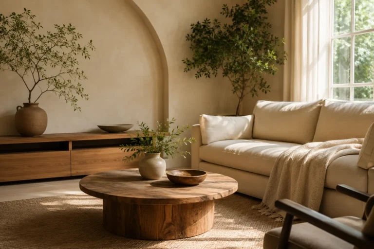
This is also why the trend works beautifully with natural materials. Linen curtains, raw wood, woven baskets, stoneware, brushed metal, jute rugs, and imperfect ceramics all look more grounded when placed against tonal walls. The gradient becomes a quiet bridge between the architecture and the objects inside the room. Instead of making furniture appear like separate pieces floating against a blank wall, it helps everything feel more connected. That visual connection can make a space feel more settled, which is one of the central goals of slow living interiors.
Why Soft Transitions Feel Better Than Hard Contrast
Hard contrast can be exciting, but it can also make a room feel visually loud when it is used without balance. A black accent wall against bright white surfaces, for example, can look dramatic in photos but feel restless in daily life. Gradient painting offers another path because it creates definition without the emotional jumpiness of extreme contrast. The darker shade can still ground the room, but the lighter connected tones prevent it from feeling abrupt. That is why this technique feels especially useful for people who want depth, but not the intensity that often comes with bolder paint choices.
Soft transitions are also easier to adapt across different design styles. In a modern apartment, a taupe-to-cream gradient can make simple furniture look more elevated. In a cottage-style home, a sage-to-mist palette can support vintage wood, floral textiles, and collected objects without making the room feel old-fashioned. In a minimalist space, a barely-there clay gradient can add warmth while keeping the overall look clean. Because the colors are related, the technique gives personality without creating visual clutter.
Choosing the Right Gradient Color Palette
The most important rule for creating beautiful gradient walls is choosing colors that belong together. That does not mean every shade has to be nearly identical, but they should share an undertone so the transition feels intentional. A palette with warm undertones might include sand, beige, clay, and soft cream. A cooler palette might move from muted blue-gray to pale sky blue or from deep eucalyptus to misty green. When the undertones fight each other, the gradient can look accidental, so the secret is to build the scheme like a family rather than a random collection.
For a home that needs to feel cooler and calmer, nature-inspired palettes are usually the safest starting point. Soft greens work well because they connect the room to gardens, leaves, and the mental reset people often associate with being outside. Blue-based palettes can make bedrooms and bathrooms feel fresher, especially when paired with linen, pale wood, and warm white lighting. Earth tones can be surprisingly soothing when the deepest shade is not too red or heavy, because they create a grounded feeling without pulling the room into darkness. The best palette is the one that supports how the room should feel during real life, not just how it photographs at noon.
It helps to think of the gradient as a mood map. The darkest color usually belongs closer to the floor, where it can visually anchor the room and make furniture feel settled. The middle tone often works well on the main wall area because it becomes the emotional center of the space. The lightest tone can move upward toward the ceiling, where it gives the room lift and keeps the atmosphere breathable. This arrangement mirrors how light often works in nature, with depth below and brightness above, which is one reason the effect feels instinctively comfortable.
The Best Rooms for Trying Gradient Paint
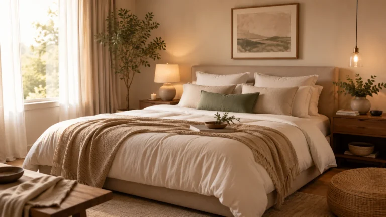
Not every room needs a gradient treatment, and that is part of what makes the trend useful. Bedrooms are one of the strongest places to try it because the whole point of the room is recovery. A soft gradient behind the bed can make the sleeping zone feel more enclosed and restful without requiring a heavy headboard or oversized artwork. Living rooms also work well, especially if they have trim, shelving, beams, or ceiling details that can act as natural transition points. Even a hallway can benefit from a gentle gradient because it turns a pass-through space into something more atmospheric.
Home offices are another interesting option because they need a balance of calm and focus. A single flat color can sometimes feel too plain, while a busy wallpaper can become distracting during long work sessions. A gradient wall gives the room visual interest without pulling too much attention away from the desk. For smaller workspaces, the key is keeping the palette subtle and letting the lightest tone do enough work to prevent the room from feeling closed in. When done well, the effect can make a work corner feel more designed, more grounded, and less like a temporary setup squeezed into leftover space.
How to Make Gradient Walls Look Modern
The difference between a modern gradient wall and an outdated ombré wall often comes down to restraint. The current version looks best when it feels connected to architecture instead of painted on as a decorative trick. That means using trim, crown molding, baseboards, picture rails, ceiling edges, built-ins, or wall panels as part of the color story. If the room has no obvious architectural breaks, the gradient can still work, but the transitions need to be measured carefully so they feel clean. A successful result should look layered and intentional, not like a craft project that escaped onto the walls.
One modern method is to use the darkest shade on baseboards and lower trim, a medium shade across the main wall, and the palest shade on the ceiling. This approach keeps the room grounded while avoiding the boxed-in feeling that sometimes happens when every surface is painted dark. Another approach is to create a horizontal fade across a tall wall, but that requires more skill because uneven blending can become obvious. Some homeowners may prefer a cleaner stacked gradient, where each shade has a defined zone but still belongs to the same color family. That version is easier to maintain, easier to repaint, and often more elegant in everyday homes.
The ceiling matters more than many people think. For years, ceilings were treated as default white surfaces, even when the rest of the room had carefully chosen color. Gradient design challenges that habit by treating the ceiling as part of the emotional experience. A pale ceiling shade can soften overhead light, make a room feel more complete, and reduce the harsh break between wall and ceiling. This is especially helpful in bedrooms, dining rooms, and reading rooms where the goal is not brightness alone, but atmosphere.
Paint Finish, Lighting, and Texture Matter
Color choice gets most of the attention, but paint finish can make or break the final mood. Matte and low-sheen finishes usually feel softer, which works well for restful rooms and slow living spaces. Satin or eggshell can be useful on trim because it adds a slight difference in texture without changing the color story too much. High-gloss finishes can look beautiful in a dramatic dining room or powder room, but they may feel too reflective for a calm bedroom. The best choice depends on how much light the room gets and how much visual softness the homeowner wants.
Lighting also changes everything. A gradient that looks cool and subtle in daylight may become warmer under evening lamps, which can be a good thing if the palette was planned with that shift in mind. Before painting an entire room, it is worth testing large swatches in several spots and watching them during morning, afternoon, and night. North-facing rooms may need warmer tones to avoid looking gray, while sunny rooms can usually handle cooler shades without feeling flat. Because gradient paint depends on nuance, skipping the testing stage is one of the easiest ways to end up with a room that feels different from the original vision.
The Wellness Side of Better Everyday Spaces
The wellness side of gradient walls is subtle, but it is still important. No paint color can solve stress on its own, and a beautifully painted room cannot replace sleep, boundaries, or healthier routines. Still, the spaces people live in can either support calm or quietly add friction to the day. A room with harsh contrast, cluttered surfaces, and cold lighting may make relaxation harder, even if the furniture is expensive. A room with softer color movement, balanced lighting, and thoughtful materials can make it easier to downshift.
This is where the phrase better everyday spaces becomes meaningful. A better space is not always bigger, newer, or more luxurious. Sometimes it is simply a room that makes breakfast feel less rushed, helps a person read instead of scroll, or makes bedtime feel like an actual transition rather than a collapse. Gradient paint supports that kind of everyday improvement because it changes the feeling of the room without demanding a full renovation. For renters or budget-conscious homeowners, even one carefully chosen wall treatment can make a familiar space feel more intentional.
There is also a sensory quality to tonal rooms that fits the wellness conversation better than many louder design trends. When the colors are closely related, the room feels more cohesive, and that can reduce the sense of visual noise. When the darker tone is placed low and the lighter tone rises upward, the room can feel balanced in a way that people may notice emotionally before they analyze visually. This is not about turning every home into a spa. It is about using design choices to create rooms that make ordinary life feel more supported.
Why the Trend Works for Small Homes Too
Some people may assume gradient walls only work in large rooms with tall ceilings and expensive architectural details. Large spaces can definitely show off the effect, but small homes can use the idea in a more focused way. In a compact bedroom, a gentle gradient behind the bed can create depth without adding bulky furniture. In a studio apartment, tonal paint can help separate a sleeping area from a living area without building walls or adding more objects. In a narrow hallway, a lighter upper shade can make the space feel less compressed while the lower shade adds character.
The key for smaller spaces is avoiding too many dramatic transitions. A tiny room with four strong colors may feel more chaotic than calm, especially if the furniture and decor are already varied. A two- or three-tone palette often works better because it gives the room depth without overwhelming it. Soft sage, pale olive, and warm white can create a gentle garden-like mood, while warm beige, mushroom, and cream can make a compact room feel grounded and quietly elevated. The goal is not to prove that the wall is trendy, but to make the room feel easier to live in.
Small homes also benefit from the way gradient paint can reduce the need for extra decoration. If the wall already has subtle movement, the room may not need a large gallery wall, heavy shelving, or several competing accent pieces. That can make cleaning easier, improve visual flow, and support a more relaxed daily routine. For people trying to simplify their homes without making them feel empty, this is a major advantage. A well-painted wall can carry enough atmosphere to let the rest of the room stay simple.
How to Style Furniture Around Gradient Walls
Furniture styling should support the gradient instead of fighting it. If the wall moves through soft greens, furniture in natural wood, cream upholstery, and black or bronze accents can help the room feel grounded. If the palette leans blue, warm materials like oak, rattan, wool, and brass can keep the room from feeling too cold. For earth-toned gradients, lighter linens and pale stone accessories can stop the palette from becoming too heavy. The best styling choices usually repeat the wall colors in smaller doses, so the room feels connected without becoming overly matched.
Texture is especially important because a gradient wall already brings visual softness. Flat, shiny furniture can sometimes make the wall feel disconnected, while tactile materials create a more natural relationship. Bouclé, linen, cotton, washed wood, clay, travertine, cane, and aged metal all work well because they add quiet variation. Plants can also look beautiful against gradient paint, especially when the palette includes green, beige, clay, or blue-gray tones. The overall idea is to style the room as if the wall is part of the landscape, not just a colored surface behind the furniture.
Art can still work, but it needs to be chosen with care. A gradient wall is already doing some of the visual storytelling, so oversized art with loud color may interrupt the calm unless the room is meant to feel energetic. Line drawings, textured canvases, black-and-white photography, soft landscapes, or sculptural wall pieces often work better. Mirrors can also be useful because they catch the tonal shifts and reflect them back into the room. The strongest rooms usually let the gradient, furniture, and objects speak in the same tone of voice.
The DIY Reality: Beautiful, But Not Careless
Although gradient painting can look effortless, it is not a trend to rush without planning. The easiest version for most people is not a fully blended mural-like fade, but a tonal layering approach using clear architectural zones. That might mean one color on baseboards, a related color on walls, and a lighter shade on the ceiling. It can also mean a darker lower wall and lighter upper wall divided by a chair rail or clean painted line. This gives the feeling of gradient design while keeping the project realistic for a weekend refresh.
Preparation matters because imperfect edges become more noticeable when multiple tones meet. Walls should be cleaned, patched, sanded where needed, and primed if the existing color is strong. Painter’s tape can help create crisp transitions, but it needs to be applied carefully and removed at the right time to avoid peeling. It is also smart to label each paint can and test the order of the colors before committing. A gradient wall is all about relationship, so even beautiful individual colors can fail if their sequence feels awkward.
For people who want a more seamless fade, hiring a skilled painter may be worth it. Smooth blending takes patience, timing, and confidence with wet edges, especially across large surfaces. A professional can also help decide whether the room needs three tones, four tones, or a simpler two-tone interpretation. That said, the trend does not have to be expensive to feel sophisticated. The most important ingredients are a thoughtful palette, a clear plan, and a willingness to let the room’s architecture guide the design.
What Gradient Walls Say About 2026 Home Design
The popularity of gradient walls points to a bigger change in how people think about interiors. Home design is moving away from single-note trends and toward spaces that feel more layered, personal, and emotionally useful. People still care about style, but they also care about whether a room helps them feel better at the end of the day. That is why trends connected to warmth, nature, softness, and sensory comfort are gaining attention. The home is no longer just a backdrop for life; it is becoming part of how people manage life.
This trend also reflects a more mature relationship with color. For a long time, many homeowners treated color as risky and neutrals as safe. Then the design world swung toward bold, immersive rooms where everything could be painted a deep dramatic shade. Gradient painting sits somewhere in between because it makes color feel approachable while still giving the room personality. It lets people experiment without turning the home into a showroom of extremes. In that way, it feels aligned with a more balanced and human version of design.
There is also something quietly optimistic about the trend. A gradient wall suggests movement, change, and transition, but in a controlled and comforting way. It feels like sunrise, shade, water, fog, or the slow fade of evening light across plaster. Those associations matter because the most memorable homes often connect design choices to emotional memories. When a wall can make someone feel calmer before they even sit down, the paint has done more than decorate.
Common Mistakes to Avoid With Gradient Walls
The first common mistake is choosing colors that are too unrelated. A purple-to-yellow wall may be interesting in a creative studio, but it probably will not create the cool, calm home mood most people want. For everyday interiors, related tones almost always age better because they feel intentional rather than experimental. Another mistake is making the darkest shade too dominant in a room that already lacks natural light. Depth is beautiful, but if the space becomes gloomy, the gradient has lost its purpose.
Another issue is ignoring the rest of the home. A gradient room should still make sense with nearby spaces, especially in open-plan layouts. If the living room has a soft green gradient but the kitchen nearby has stark white cabinets, bright chrome, and cool gray floors, the transition may feel disconnected. That does not mean every room has to match, but the undertones should have a conversation. Carrying one small color reference into another area, such as through textiles or accessories, can help the whole home feel more cohesive.
Finally, some people over-style the room after painting. Because gradient walls add depth on their own, the surrounding decor can usually be simpler. Too many patterns, too many art pieces, or too many accent colors can bury the softness that made the wall appealing in the first place. A calmer approach often works better, especially for bedrooms, wellness corners, and quiet living rooms. Let the wall set the rhythm, then choose furniture and objects that move with it instead of competing against it.
Conclusion: A Softer Way to Cool the Home
Gradient walls are more than a paint trend because they answer a real craving in modern homes. People want rooms that feel cooler, calmer, warmer, softer, and more personal, often all at the same time. This technique offers that balance by layering color in a way that feels natural, architectural, and emotionally easy to live with. It can make a bedroom feel like a retreat, a living room feel more grounded, or a small apartment feel more intentional without requiring a complete renovation. In a design moment shaped by wellness, slow living, and the search for better everyday spaces, gradient paint feels less like a passing aesthetic and more like a new language for comfort.
The best part is that the idea can be adapted to many homes, budgets, and styles. A renter might try it on one removable panel or a small feature wall, while a homeowner might carry the palette across trim, walls, and ceiling for a more immersive effect. A minimalist might use barely-there neutrals, while someone with a love of color might explore muted greens, dusty blues, or layered terracotta. What matters most is not how dramatic the result looks online, but how the room feels during ordinary life. When a wall can slow the eye, soften the mood, and make home feel like a real retreat, it has earned its place in the next chapter of interior design.